
Case study · Recovery nonprofit
Kinnic Falls Inc: a website that makes the first step clear
A recovery nonprofit whose website is read by people at a hard moment, and by the counselors who refer them. We built a calm, plain site that explains each program and the steps to admission.
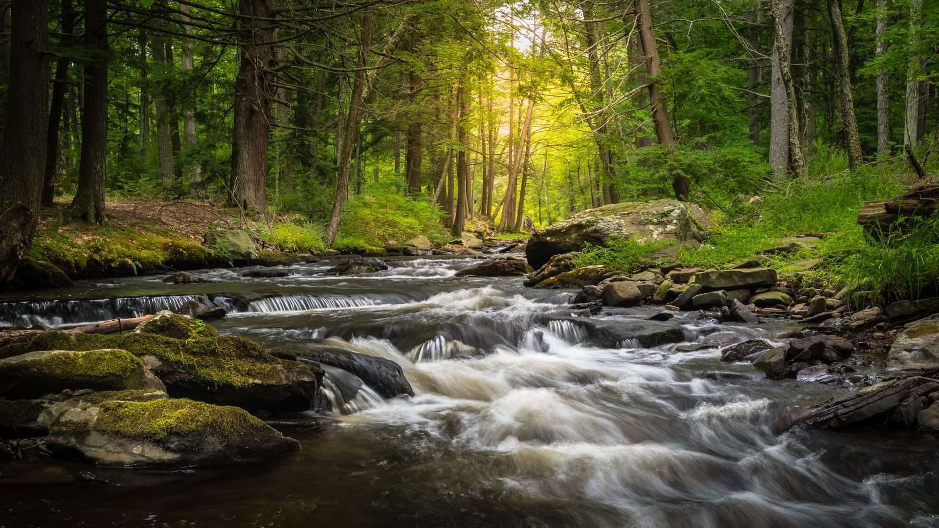
The results for Kinnic Falls Inc
A recovery organization rooted in River Falls
Kinnic Falls Inc is a private nonprofit in River Falls, Wisconsin, licensed in the state and operating since 1972. It supports adults with substance use disorders and mental health conditions through outpatient counseling, low intensity residential treatment and the Gerber House, an extended-stay sober home.
Its campus includes a 52-bed recovery facility, the sober house, outdoor space and an office building, a short walk from the Kinnickinnic River that gives the organization its name. Kinnic Falls serves clients from both Wisconsin and Minnesota. We designed its logo and its website.
The challenge: three audiences, one careful tone
A recovery organization's website has more than one reader. There is the person looking for help, often tired and unsure whether they qualify. There is the family member searching on their behalf. And there is the counselor or case worker at another facility who needs to know, quickly, whether this is the right next placement and how to make a referral.
Each of them needs different information, and all of them need it without pressure. Treatment language can be hard to follow, with levels of care, funding sources and eligibility rules. The site had to explain those in ordinary words, be honest about who the programs are for, and make the first step feel manageable.
What the new site had to do:
- Describe each program clearly enough that a reader can tell which one fits.
- Set out the admission steps so the process feels known, not daunting.
- Give referring counselors their own page, form and funding details.
- Keep the design calm and easy to read on a phone.
What we built
A quiet, readable site with separate paths for people seeking help and for the professionals who refer them, and a phone number in view the whole way.
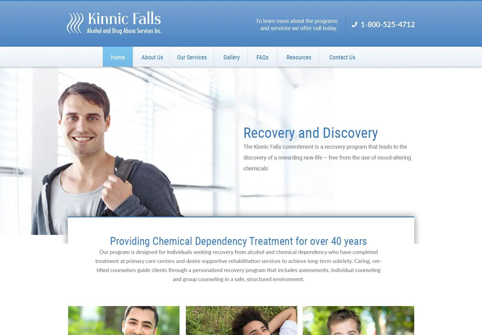


A page for each program.
Outpatient services, low intensity residential treatment and the Gerber House sober home are each explained on their own page. The Programs page shows how they connect as stages, so a reader can see where they might start and what could follow.
Pages for the conditions served.
Alcohol and marijuana recovery, opioid and prescription drug recovery, stimulant recovery, and mental health and co-occurring disorders each have a page. Someone searching for help with one specific struggle lands on words written about it.
A "Your Next Step" page.
This page says who the residential program is for, lists the steps to admission in order, and explains what the organization will need to confirm about coverage. It also says that if Kinnic Falls is not the right fit, staff will suggest somewhere that is.
A page for counselors and referrals.
Referring professionals get a referral form, a fax number, the eligibility criteria and the funding sources accepted in Minnesota and Wisconsin, all in one place and written for someone who makes placements for a living.
The setting, shown honestly.
Photos of the campus, the trails beside it and the river nearby show where a client would be living. For someone weighing a residential stay, seeing the place matters as much as reading about it.
A logo and a steady look.
We designed the Kinnic Falls logo and carried its colors through the site. The pages use generous spacing and readable type, and the photos are of the real place, so the tone stays calm and respectful.
How the project ran
Discovery
We learned who contacts Kinnic Falls and what each of them asks first, and mapped the site around those readers.
Logo and design
The logo and a restrained color palette came first, followed by page designs that Kinnic Falls reviewed before the build.
Build and content
We built the site on WordPress and set up the program pages, the contact form and the referral form. Kinnic Falls reviewed the wording on every page.
Launch and updates
The site has grown since it went live as the organization's services have, with pages added and revised on request.
The results
The site gives each reader a clear way in. A person seeking help can read about the programs, check the eligibility list and see exactly what happens after they fill in the form. A counselor can go straight to the referral page and find the criteria and the funding details without calling to ask.
For staff, that means the first conversation starts further along. People who get in touch have usually read what the programs involve, so the call can be about their situation instead of the basics.
The organization also has room to tell its wider story. Supporters, donors and job seekers each have a page, alongside success stories and a blog, without crowding the path for someone who needs help today.
Google Lighthouse scores out of 100 for the live site, measured November 12, 2026.
Services on this project
Logo Design
A logo drawn for the business and delivered in every format it is used in.
Website Design
Page layouts designed around how this client's customers decide and buy.
Website Development
The build itself: fast, responsive pages and the custom features the project needed.
In the same line of work? See how we build healthcare and therapy websites.
Frequently Asked Questions
What other nonprofits and care providers ask us about this project.
Plainly and with care. The Kinnic Falls site describes its programs and its campus so that someone looking for help can find the right door, without jargon and without pressure. The client reviews every word before it goes live.
Yes, if each has a clear path. Kinnic Falls has a "Your Next Step" page for people seeking help and a separate page for counselors with a referral form and funding information. Both are in the main menu, so nobody has to hunt.
Yes. We designed the Kinnic Falls logo along with the website, and delivered it in the formats needed for signs, letterhead and print. Our logo design page shows how the process works.
Most sites launch within 4 to 8 weeks. For a care provider the wording takes the most time, because program descriptions, eligibility and funding details need to be checked by the people who work with them every day. We build that review into the schedule from the start.
More projects like this
-
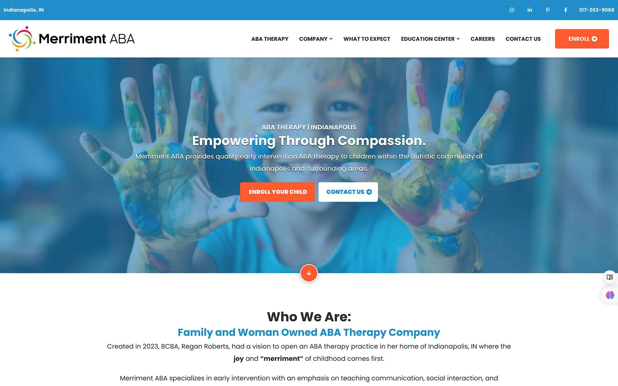
Merriment ABA
A therapy provider that parents could not find in search, and that had to earn their trust within seconds once they did. We designed the logo, built a calm website around the questions parents ask, and ran the SEO that moved it up Google.
View Case Study: Merriment ABAView the Website: Merriment ABA
-
The Spinal Frontier
A walk-in chiropractic practice with a sense of humor, and a website problem most clinics share: sounding like every other clinic. We built a one-page site that keeps the practice's voice and brings in local patients with SEO and Google Ads.
View Case Study: The Spinal FrontierView the Website: The Spinal Frontier
-

River Falls FFA Alumni
An alumni organization that supports agricultural education in River Falls, Wisconsin. The site presents scholarships, classroom donations and hands-on resources for students, and asks visitors to get involved.

Tell us about your business
A few details are enough to start: what you do, who you want to reach and what you need help with.
Jason reads each request and replies in under 24 hours with next steps.